Ok well I’m going to get straight to the point here. If you already own the 5D mkII, in my opinion the mkIII isn’t going to be an upgrade you desperately make. The difference in image quality is so small it’s not significant. All the improvements are mainly ergonomic and general functions. I’d only get one if my mkII kicked the bucket.
Now I only had the camera for a short time, and this isn’t a ‘scientific’ test but the images below are pretty much direct comparisons. First though, what did I like about the camera!?
1. 100% viewfinder
This is plain and simply great. Miss having this after years of shooting on the 1n. 100% over 98% doesn’t sound much, but it doe’s make a big difference.
2. 3:2 ratio screen
One of the things I dislike about the mk2 is the 4:3 screen, I always find framing a little awkward with it. The screen on the mk3, as well as being bigger, is much easier to frame with. It does have a problem in that it can have a lot of info over-laid on it in live view but I’m sure I’d get used to it.
3. Digital Level
This is a great and handy tool. It is VERY sensitive, but easy to get to grips with. Using it in Live View though it has to fight for space with other info and that’s a big shame. It gets really small compared to when it’s on it’s own when not using Live View. There may be a way to get it to come on separate using the Q button, but I couldn’t figure it out.
4. Upto 7 shots in AEB
Means some big HDR potential. I did a few tests but not really had a good play. If I was doing lots of HDR spheres this would probably be a deal maker in itself. I didn’t try the HDR mode in the camera, ’cause as I shoot raw I don’t really need it.
5. Auto ISO that actually works properly
It’s kinda useless on the mk2, but on the mk3 it works as I think it should! Put the camera in manual, pick a shutter speed and aperture, let the camera pick the iso automatically.
So what didn’t I like?
Well there are a little things here and there relating to functionality, like not being able to pick the focus point directly with the rear joystick. I find the grip uncomfy, compared to the mk2, which isn’t as comfy as the mk1. But then I’m comparing them all to the 1n which is really nice to hold. Having the Live View options as separate items in the menu and not appearing to be able to register them in the quick menu.
IMAGE QUALITY
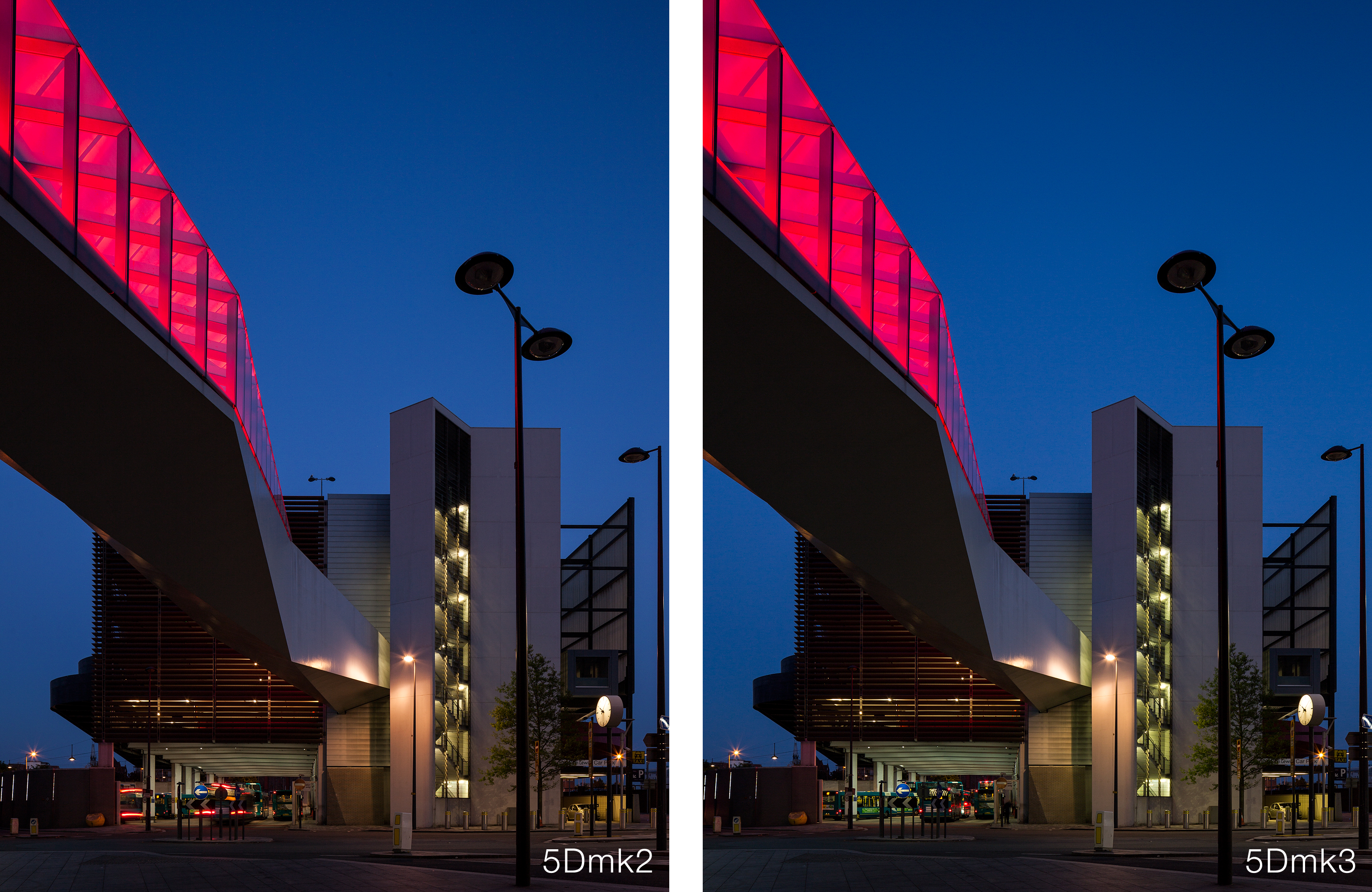
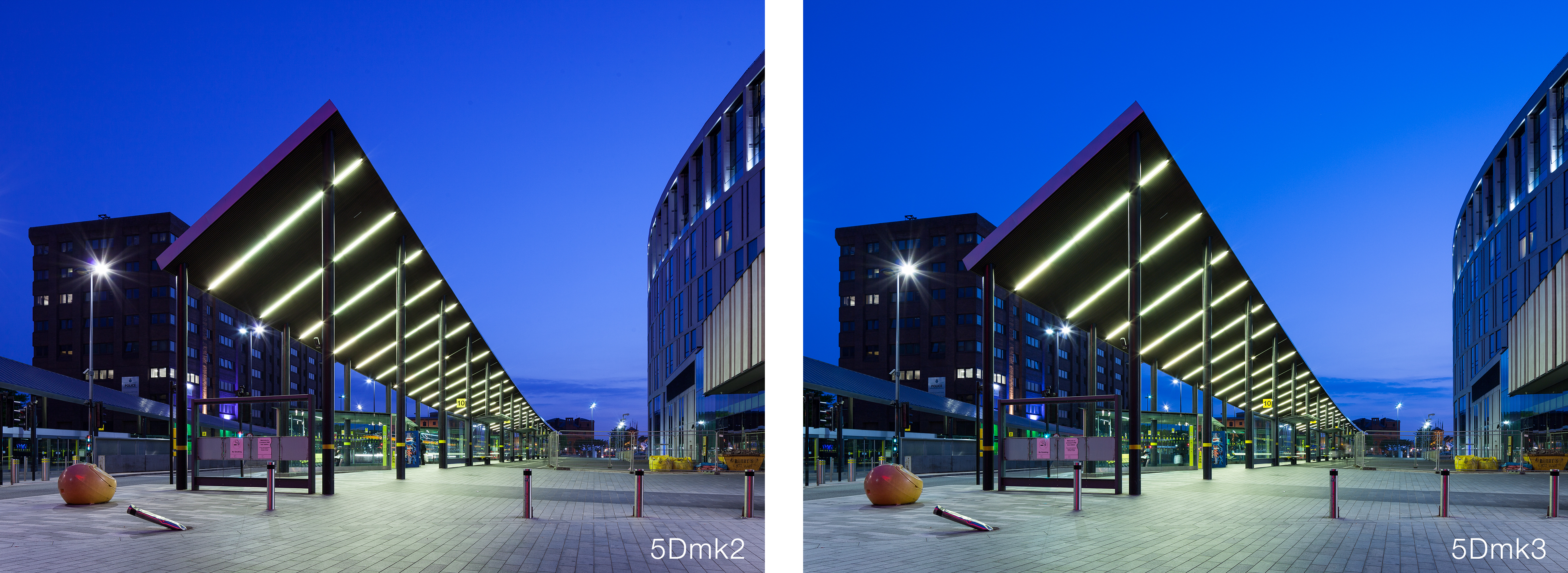
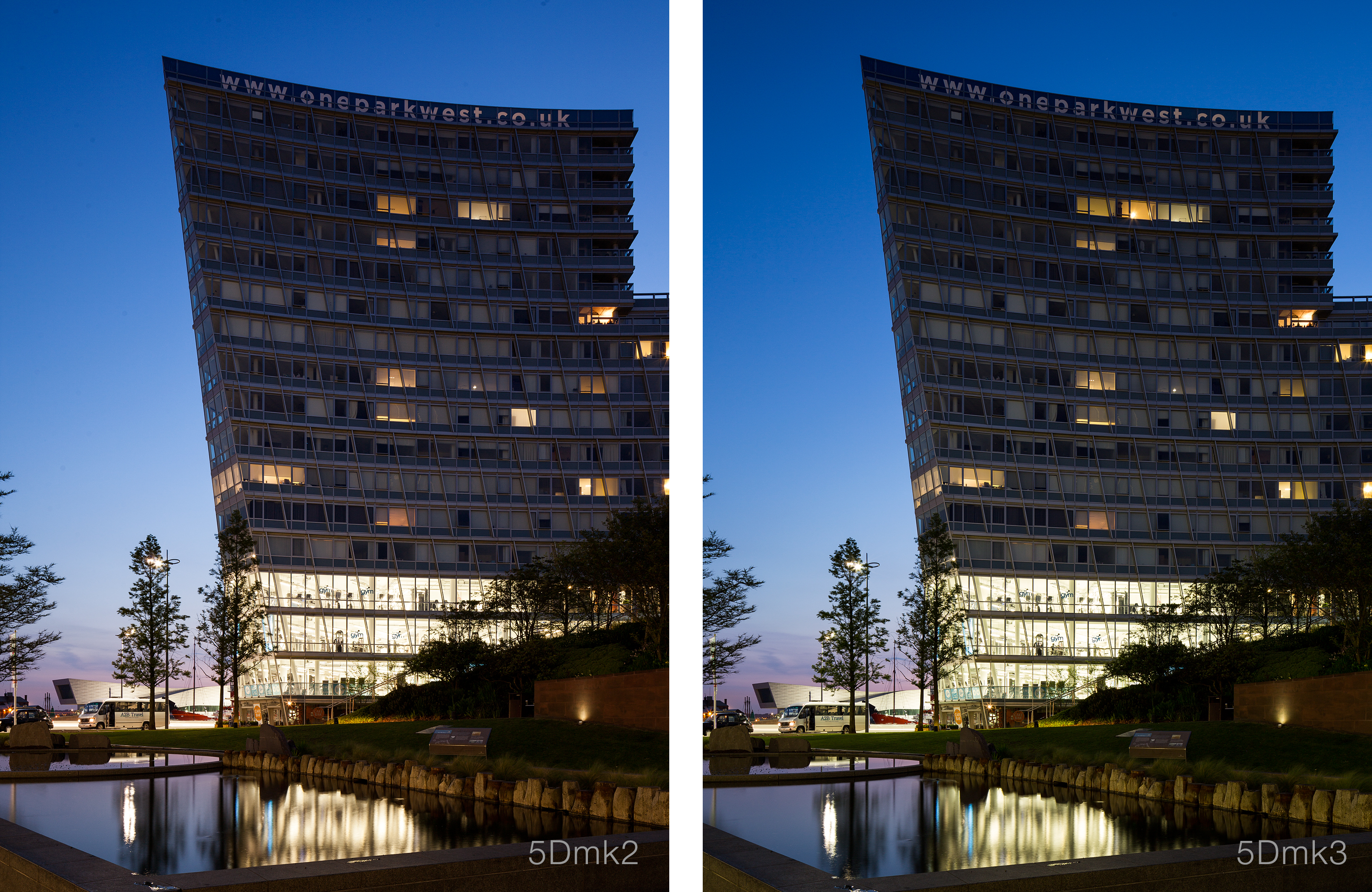
Anyway lets look at some images. These have all had the same settings applied in Lightroom, WB, contrast etc. All are taken with the 24mm ts-e II using the same shift. They where all then sharpened with Nik Sharpener. The only weak link here is that I forgot to reset the Picture Style in the mk2 to Standard from my user setting. All shots at 100iso.
Generally what I would say about the images below is that the sharpness is identical really. The extra 1mpx makes very little difference. The biggest difference I can see is the in the colors. The mk3 seems to have crisper, more accurate colors, with a little extra saturation. This could be down to what my Picture Style settings are on the mk2, but then I’m not sure how much those settings actually effect RAW files. At this ISO noise is basically not a problem.
Now I haven’t had a chance to compare high ISO shots from each camera yet, but the mk3 does look to perform better, but really its just more detail. Images at 6400iso off the mk3 are still really grainy!
So have a look at these comparisons. If you want bigger shots click on each one and it should open much larger.
Overall as I say I’m not in any rush to upgrade. If I was looking to replace my mk1 again, then I’d certainly go for one over the mk2 (which is still available!!). But for now I’ll wait until my mk2 dies.


