GF Smith Fine Collection

October 21st, 2016

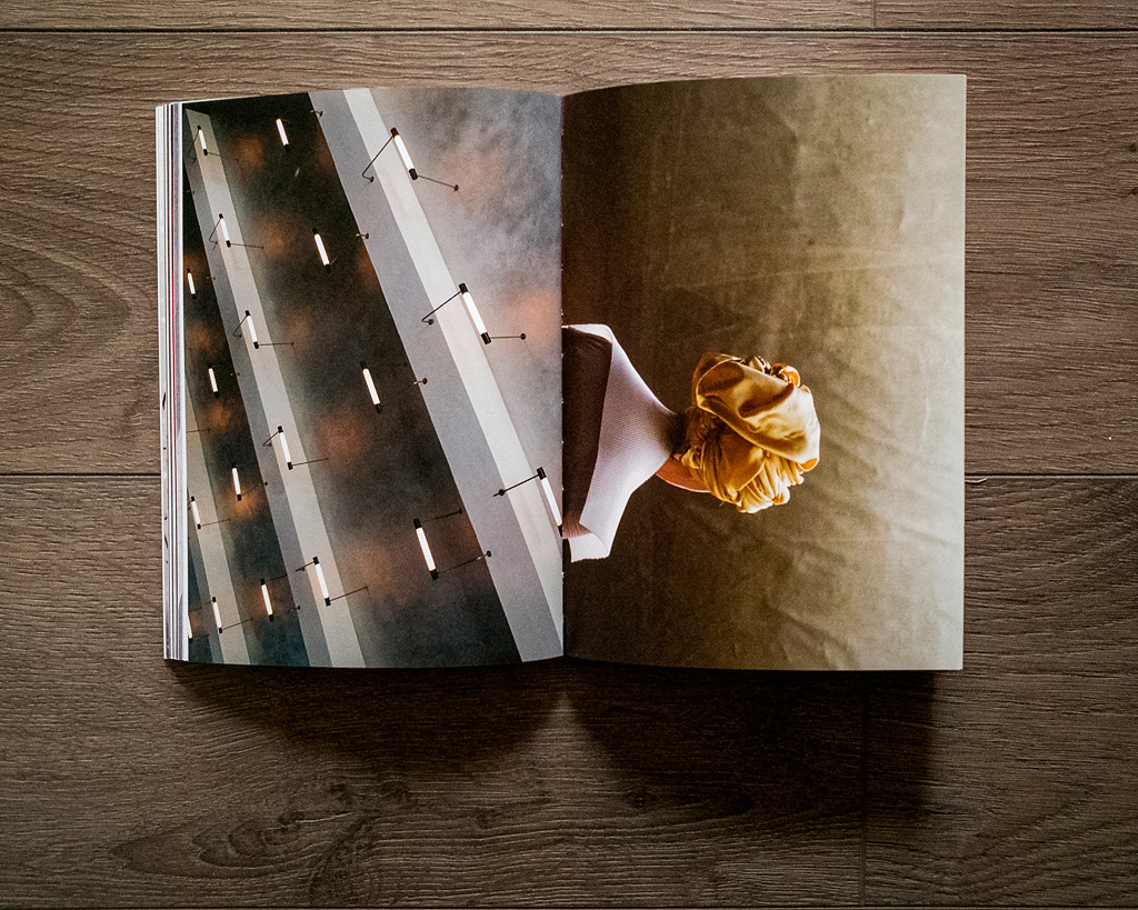
Well over a year ago now, my good friend Matt from Stride Studio sent me a link to a project being run for GF Smith, that was looking to crowd source a set of images for their new paper sample book, the Fine Collection. The idea was really simple, upload some images to collaboratewith.gfsmith.com, and they will pick a series to be featured on the pages of the book, to showcase how good the set of papers used are for photographic output.

Now I’m pretty pessimistic with things like this, but as I love the sample books GF Smith do, and always wanted to be featured in one. I picked six of my favorite images and uploaded them.

I’m so glad I did though. While I was asked for 3 of the images in high res, about three months after submission, I then didn’t hear anything about the project from GF Smith or their designers. Even the guys on the GF Smith stand at the Photography Show didn’t know anything about the project. So I resigned to thinking that I hadn’t made the final cut.

That was until an email landed in my inbox the other day, from someone asking me about this image of mine they had seen in the Fine Collection. I replied back asking which image it was, but also called GF Smith to see if I could get a copy.

The book arrived yesterday and I couldn’t be happier to see that I am actually featured in it (I’ve had a lot of work miss-credited to me recently!). A definite career highlight so far and little dream come true.

blogpipes

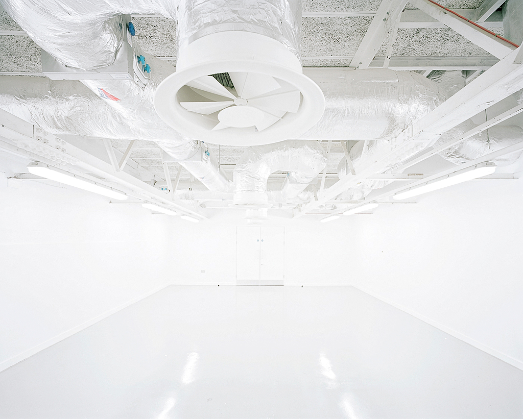
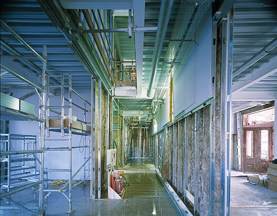
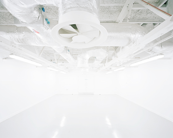
This is the image they chose, it’s one I shot on large format film back in 2011. The room was a renovated workshop, belonging to the estates dept. at the Royal Hospital here in Liverpool. It’s been one of my favorites for a long time, with everything being white or light grey and the room so empty. I’d imagine now its filled with racks of shelves and covered in paint as it was supposed to be a paint store.

It’s so good to see this image along side the 65 other brilliant works. It’s even more amazing for me that I was selected from over ten thousand other submissions.
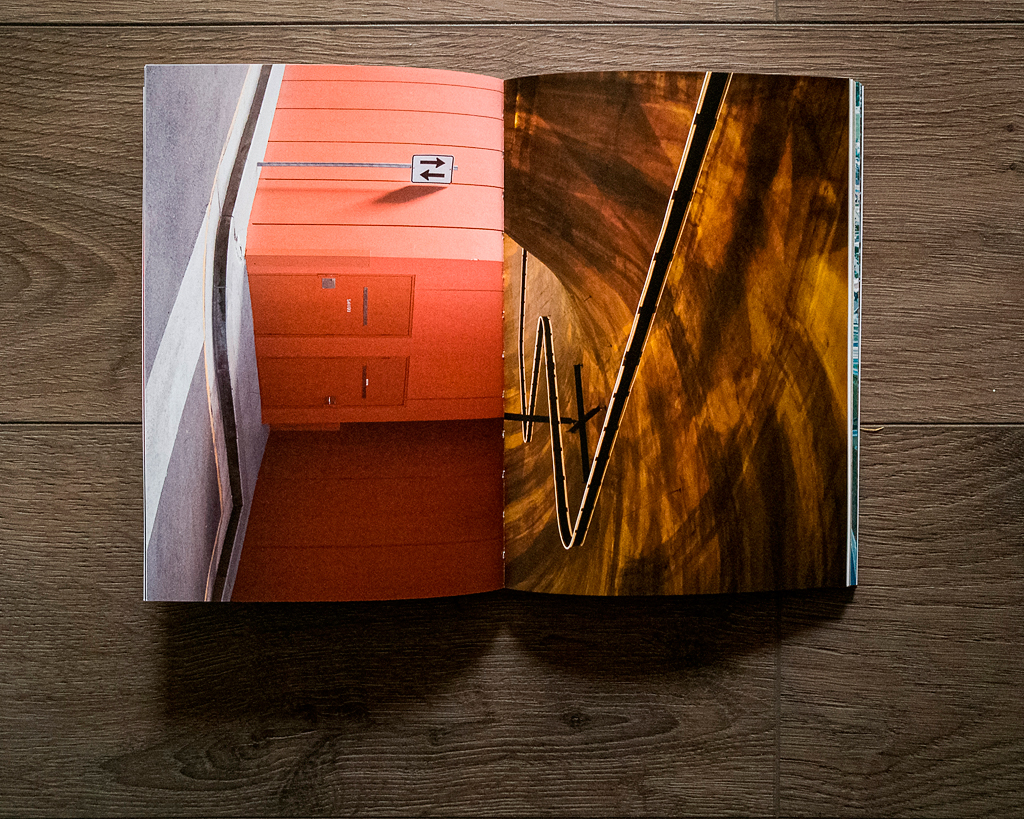
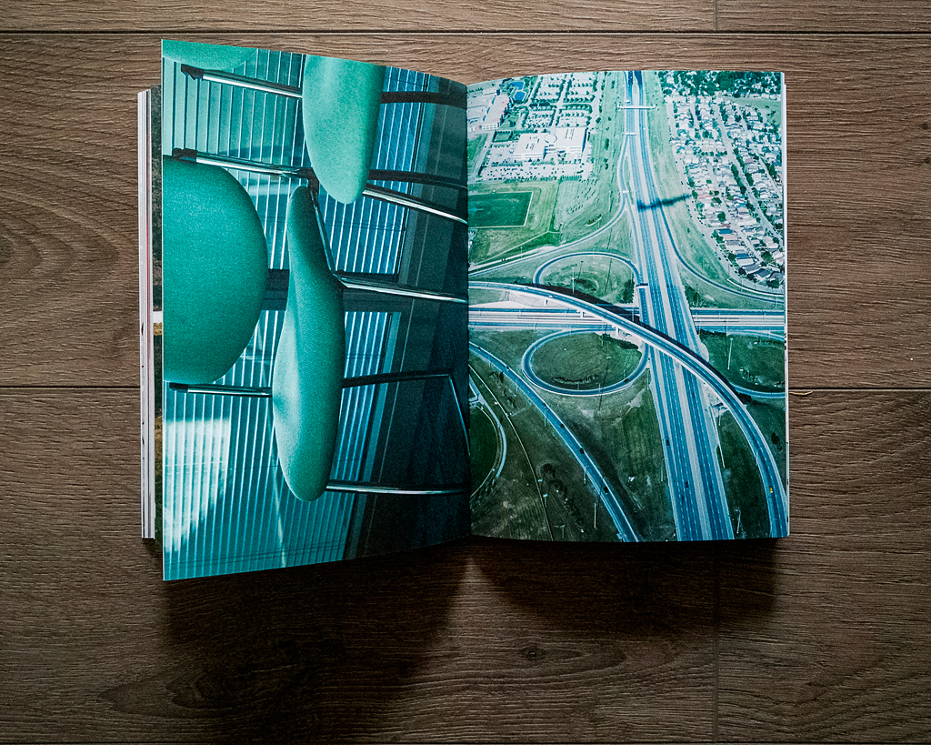
The designers have sequenced the images by color which I think works great, and is a nod to the tradition of doing that with sample books for things like ink and paint, as well as some of the older GF Smith books.

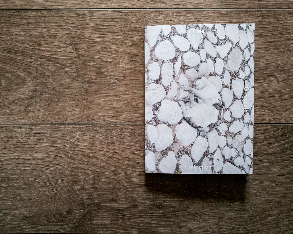
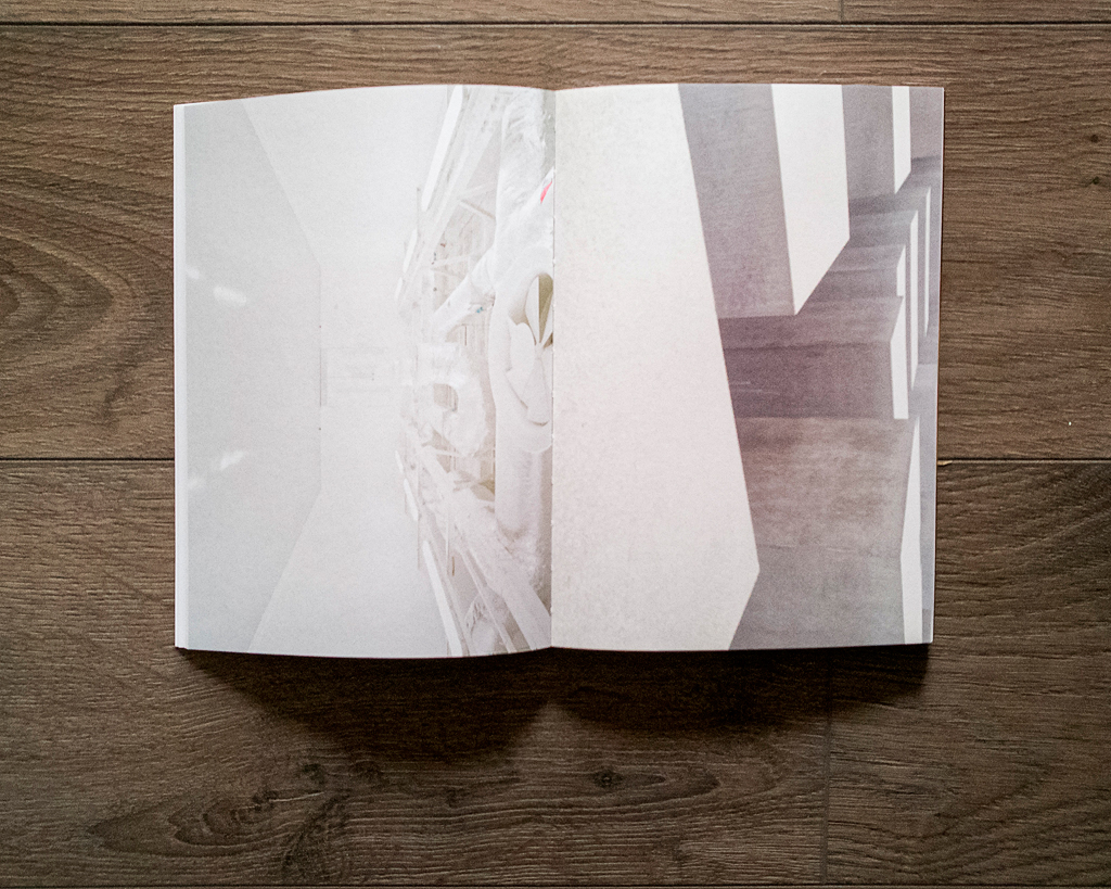
I’ve picked out below some of my favorite spreads, as well as my image along side a great shot of the Holocaust memorial in Berlin by Matt Adams. Plus there is a brilliant cat pic on the cover by Elias Fecher, everyone loves a good cat pic.

So so happy.

lrm_export_20161021_143652

lrm_export_20161021_143609

lrm_export_20161021_143548

lrm_export_20161021_143525

lrm_export_20161021_143635

5D mkII vs 5D mk III – my thoughts.

June 5th, 2013

Ok well I’m going to get straight to the point here. If you already own the 5D mkII, in my opinion the mkIII isn’t going to be an upgrade you desperately make. The difference in image quality is so small it’s not significant. All the improvements are mainly ergonomic and general functions. I’d only get one if my mkII kicked the bucket.

Now I only had the camera for a short time, and this isn’t a ‘scientific’ test but the images below are pretty much direct comparisons. First though, what did I like about the camera!?

1. 100% viewfinder
This is plain and simply great. Miss having this after years of shooting on the 1n. 100% over 98% doesn’t sound much, but it doe’s make a big difference.

2. 3:2 ratio screen
One of the things I dislike about the mk2 is the 4:3 screen, I always find framing a little awkward with it. The screen on the mk3, as well as being bigger, is much easier to frame with. It does have a problem in that it can have a lot of info over-laid on it in live view but I’m sure I’d get used to it.

3. Digital Level
This is a great and handy tool. It is VERY sensitive, but easy to get to grips with. Using it in Live View though it has to fight for space with other info and that’s a big shame. It gets really small compared to when it’s on it’s own when not using Live View. There may be a way to get it to come on separate using the Q button, but I couldn’t figure it out.

4. Upto 7 shots in AEB
Means some big HDR potential. I did a few tests but not really had a good play. If I was doing lots of HDR spheres this would probably be a deal maker in itself. I didn’t try the HDR mode in the camera, ’cause as I shoot raw I don’t really need it.

5. Auto ISO that actually works properly
It’s kinda useless on the mk2, but on the mk3 it works as I think it should! Put the camera in manual, pick a shutter speed and aperture, let the camera pick the iso automatically.

So what didn’t I like?
Well there are a little things here and there relating to functionality, like not being able to pick the focus point directly with the rear joystick. I find the grip uncomfy, compared to the mk2, which isn’t as comfy as the mk1. But then I’m comparing them all to the 1n which is really nice to hold. Having the Live View options as separate items in the menu and not appearing to be able to register them in the quick menu.

IMAGE QUALITY

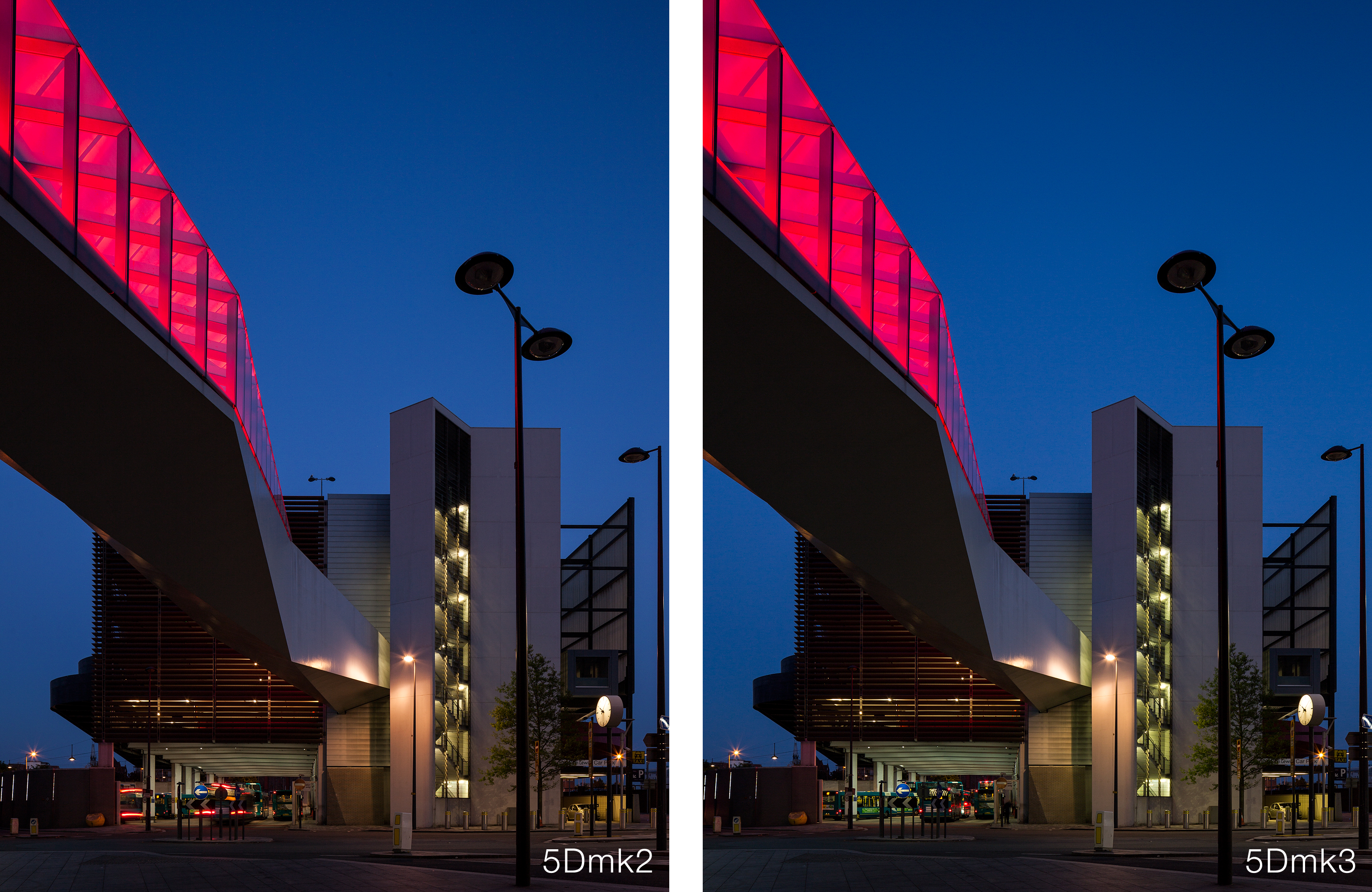
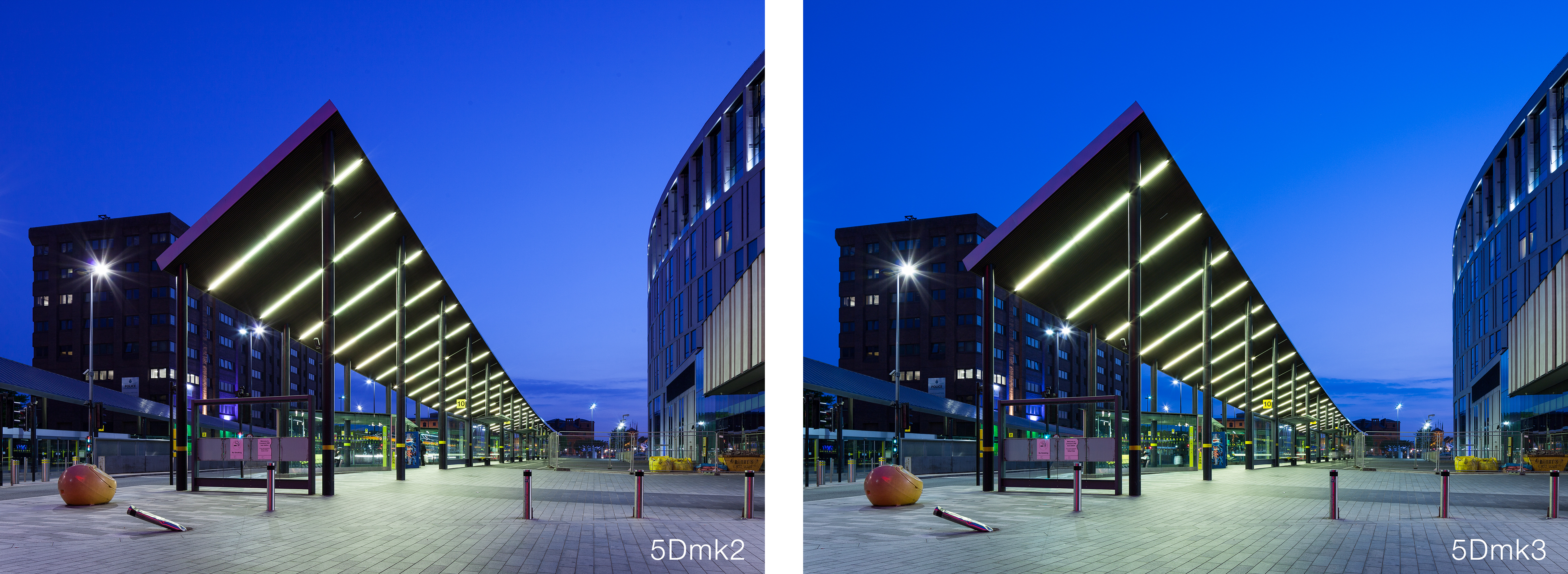
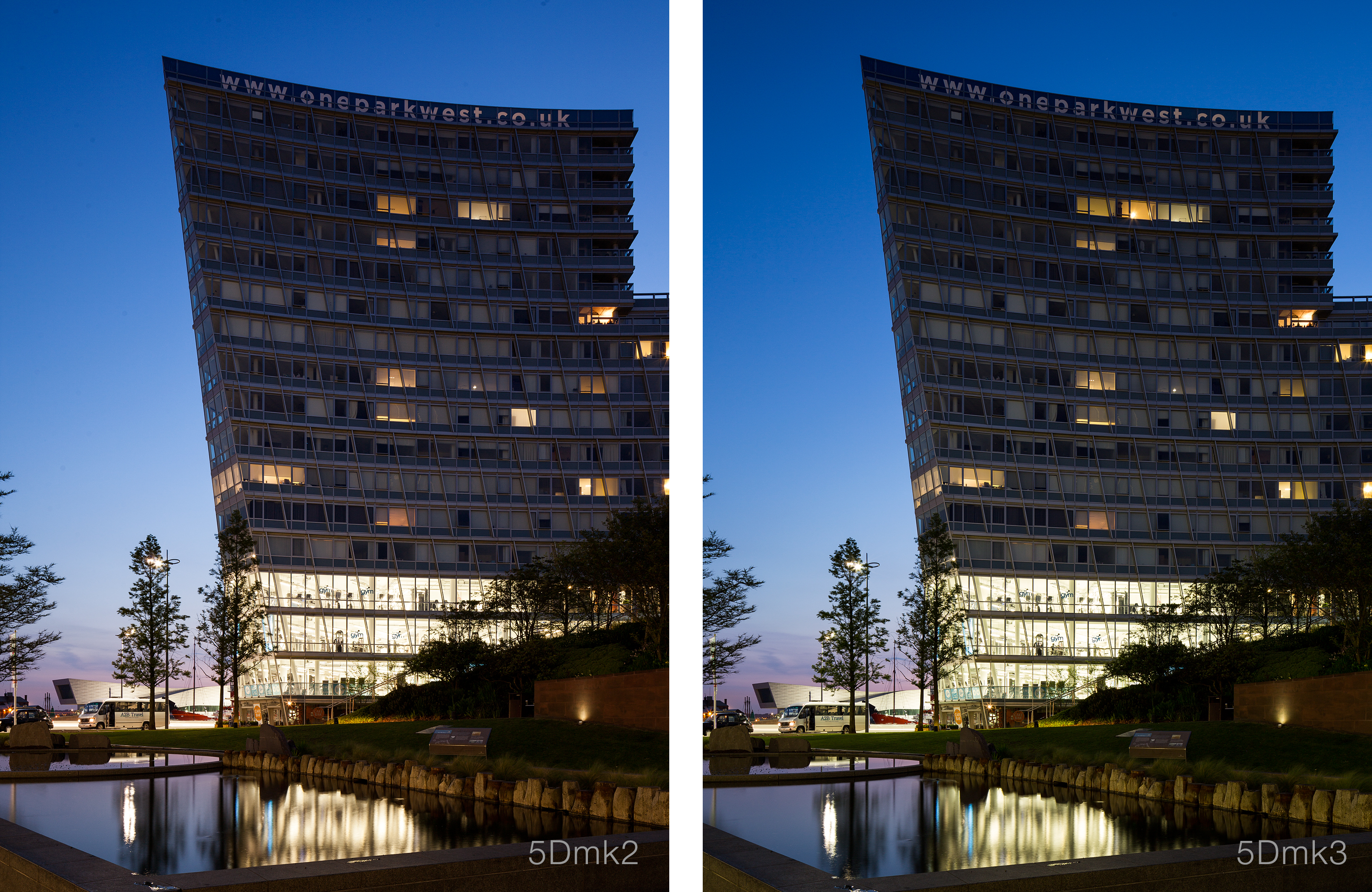
Anyway lets look at some images. These have all had the same settings applied in Lightroom, WB, contrast etc. All are taken with the 24mm ts-e II using the same shift. They where all then sharpened with Nik Sharpener. The only weak link here is that I forgot to reset the Picture Style in the mk2 to Standard from my user setting. All shots at 100iso.

Generally what I would say about the images below is that the sharpness is identical really. The extra 1mpx makes very little difference. The biggest difference I can see is the in the colors. The mk3 seems to have crisper, more accurate colors, with a little extra saturation. This could be down to what my Picture Style settings are on the mk2, but then I’m not sure how much those settings actually effect RAW files. At this ISO noise is basically not a problem.
Now I haven’t had a chance to compare high ISO shots from each camera yet, but the mk3 does look to perform better, but really its just more detail. Images at 6400iso off the mk3 are still really grainy!

So have a look at these comparisons. If you want bigger shots click on each one and it should open much larger.

5dComparo-7987

5dComparo-7988

5dComparo-7989

Overall as I say I’m not in any rush to upgrade. If I was looking to replace my mk1 again, then I’d certainly go for one over the mk2 (which is still available!!). But for now I’ll wait until my mk2 dies.

Snowy Snodownia

February 10th, 2012

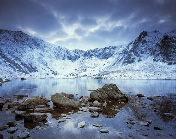
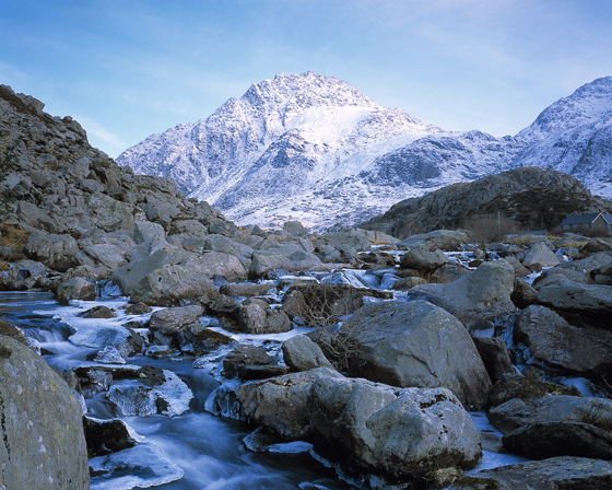
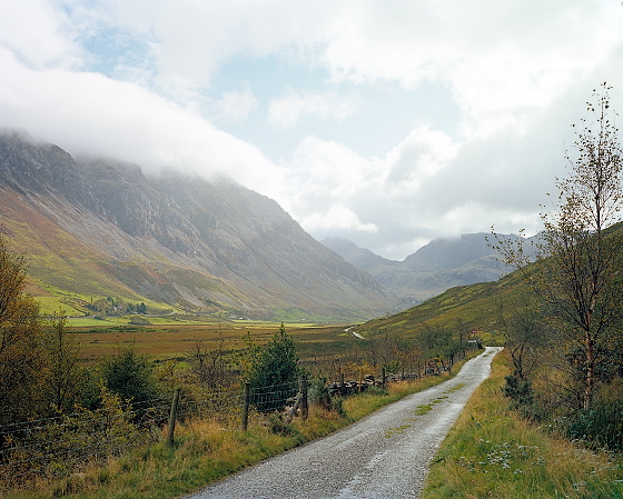
Couple of new shots from Snowdonia after a recent bit of snow. Was a bit disappointed to be honest as I didn’t get out there till the end of the week, all the lower level snow had melted. But still was a nice day out in the fresh cold air.

I’ve used a Hitech 0.6ND Soft grad on the Tryfan shot. I bought a Lee starter kit and the Hitech to see what it was like and to be honest it seems pretty good. No major color cast that I could see, definitely going to buy a few more and see how they are.

Recent Snowdonia images

October 31st, 2011

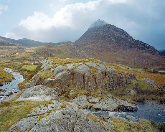
Few pics from recent trip to Ogwen.

Back in Blog

October 20th, 2011

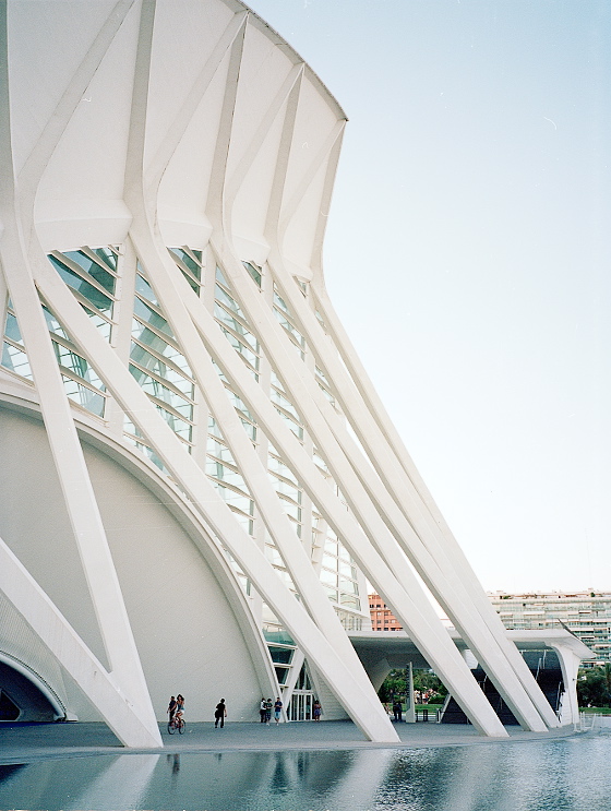
Well been a bit lax with the old blog recently but I’ve been keeping myself busy with a trip to Valencia, bunch of interesting work for Liverpool Mutual Homes and hurting my back! Anyway there are a few updates to my Flickr which you can check out by clicking one of the images below. I’m going to try and keep up with the blogging and maybe get some gear reviews done as well.

Also got round to adding some stuff to my website – www.craigmagee.co.uk

Liverpool One Interchange / Wilkinson Eyre

May 16th, 2011

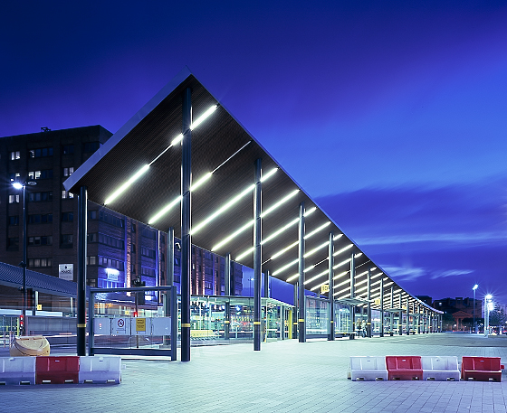
Recent shot of the bus terminal at Liverpool One, designed by Wilkinson Eyre.
Been wanting to photograph it for a while, just never got round to it.
I took this from just outside John Lewis and had about 6 Merseytravel security guards eyeing me up!
Got away without a pointless lecture. Annoying thing for me is those red and white plastic barriers that seem to litter the city.

Energy Centre / Levitt Bernstein

April 13th, 2011

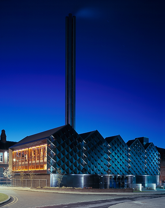
Recently discovered this little jem of a building, but think its been there about a year.

It is Liv Uni’s new energy centre designed by Levitt Bernstein and I think it looks great.

More to come.

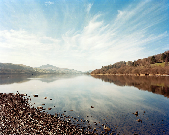
Llyn Tegid

March 28th, 2011

View across to Aran Benllyn

The paint store

February 7th, 2011

An awesome looking workshop from a recent shoot of a refurbed part of the Royal Liverpool Hospital.
This is to be a paint store. Wonder what it will look like in a few months?

Cold, cold, new year

January 18th, 2011

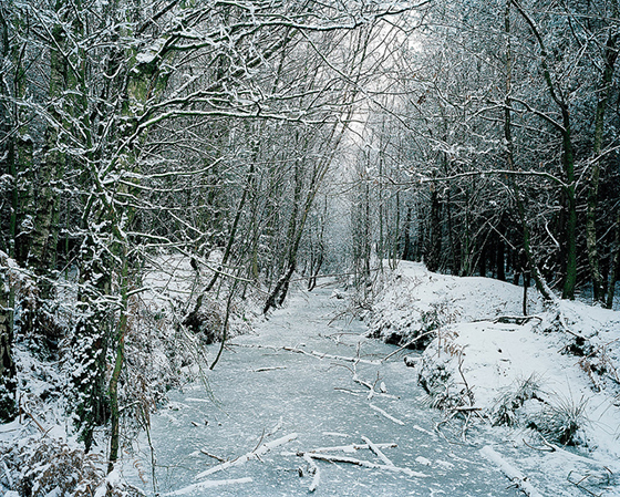
It was a pretty cold, snowy, holiday period and to be honest I decided I didn’t want to do much driving in it so had a relaxing time at home for most of it. I did however take a trip to Delamere forest one day with some friends. I didn’t shoot much except for this frozen stream feeding one of the meres.